Revamping Bunnings' account dashboard to provide customers with the most important information they need, when they need it.
Client
Bunnings
2021
Brief
Revamping the account dashboard to to ensure customers easily access essential features while simultaneously improving usability and accessibility.
Contribution
User Experience – User Interface
Visual Design – Motion
Accessibility – Micro interactions

Background
Bunnings' account experience was dated, disjointed and not scaleable. Customers expected the most important stuff at hand; but also easy navigation to less-used functionality.
Bunnings' account experience was dated, disjointed and not scaleable. Customers expected the most important stuff at hand; but also easy navigation to less-used functionality.
01
The old experience...
The old experience...
From our online chats with customers, two key themes emerged.
Firstly, users wanted specific features, including order history, order status, lists, and preferred stores to be front and centre on their dashboards.
Secondly, there was notable feedback regarding the perceived clunkiness and accessibility issues of the current dashboard design.
From our online chats with customers, two key themes emerged.
Firstly, users expressed the desire for specific features, including order history, order status, lists, and preferred stores to be front and centre on their dashboards.
Secondly, there was notable feedback regarding the perceived clunkiness and accessibility issues of the current dashboard design.
The approach
Internally, Bunnings' account experience was a wide-reach experience so we needed to bring together different team members from different parts of the business. Working collaboratively with this group, we utilised Google's design sprint framework to align on the path to the right solution.
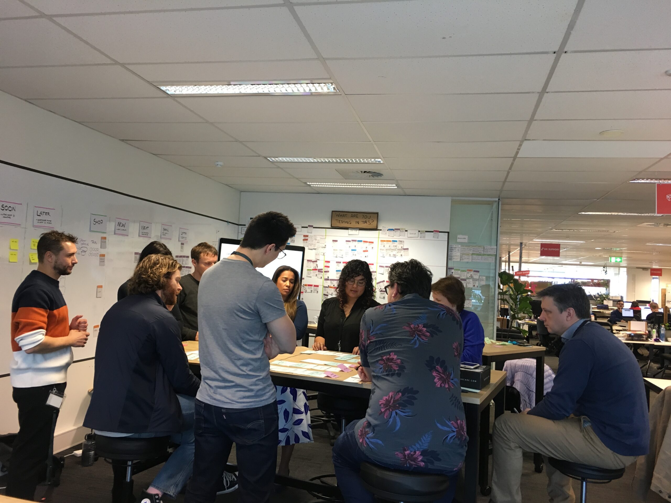
How might we
Collaborating in a team environment and framing the challenge as a 'how might we' question set us on the right path. Going through this exercise with Bunnings' internal team, who had not encountered a similar process before, has taught me a lot.
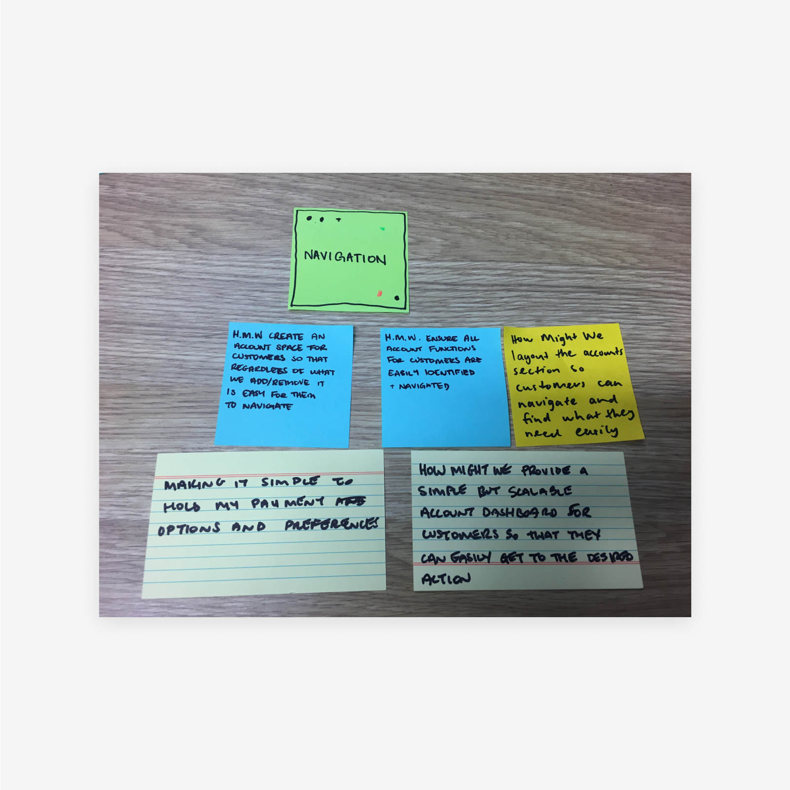
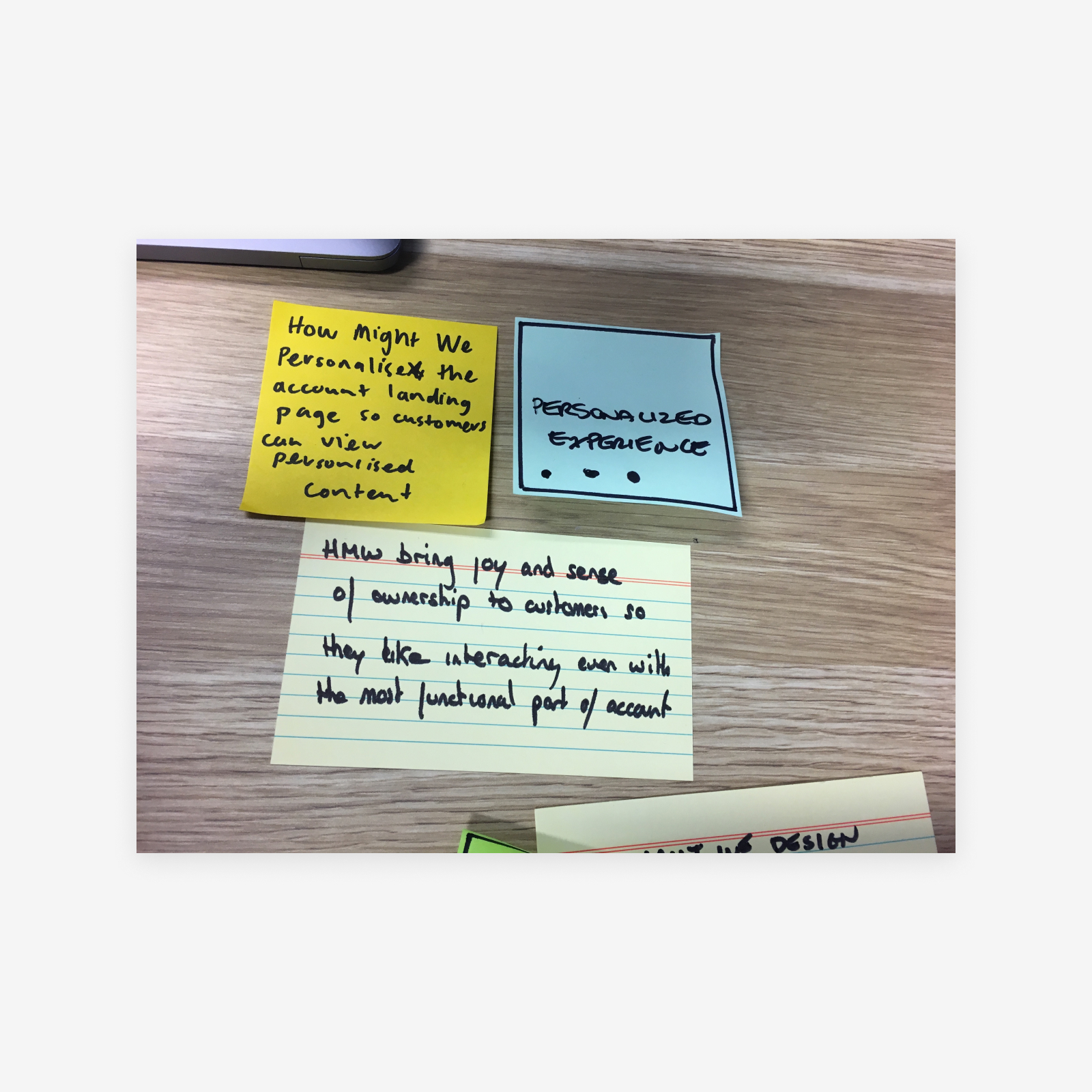


How might we organise an account section that is intuitive so that all retail and commercial customers can easily access information and perform desired actions?
How might we organise an account section that is intuitive so that all retail and commercial customers can easily access information and perform desired actions?
Solution ideation
Solution ideation
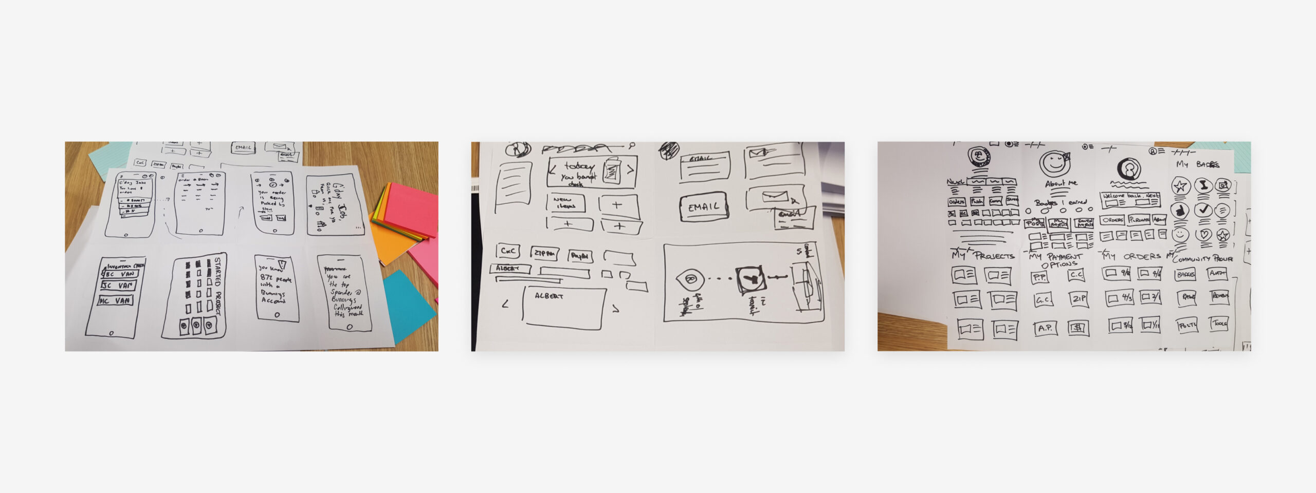
Focusing on highlighting the most desired features identified in research and enhancing overall usability and accessibility, we created a series of crazy 8s as well as detailed solution sketches with the stakeholders.
Testing & refinement
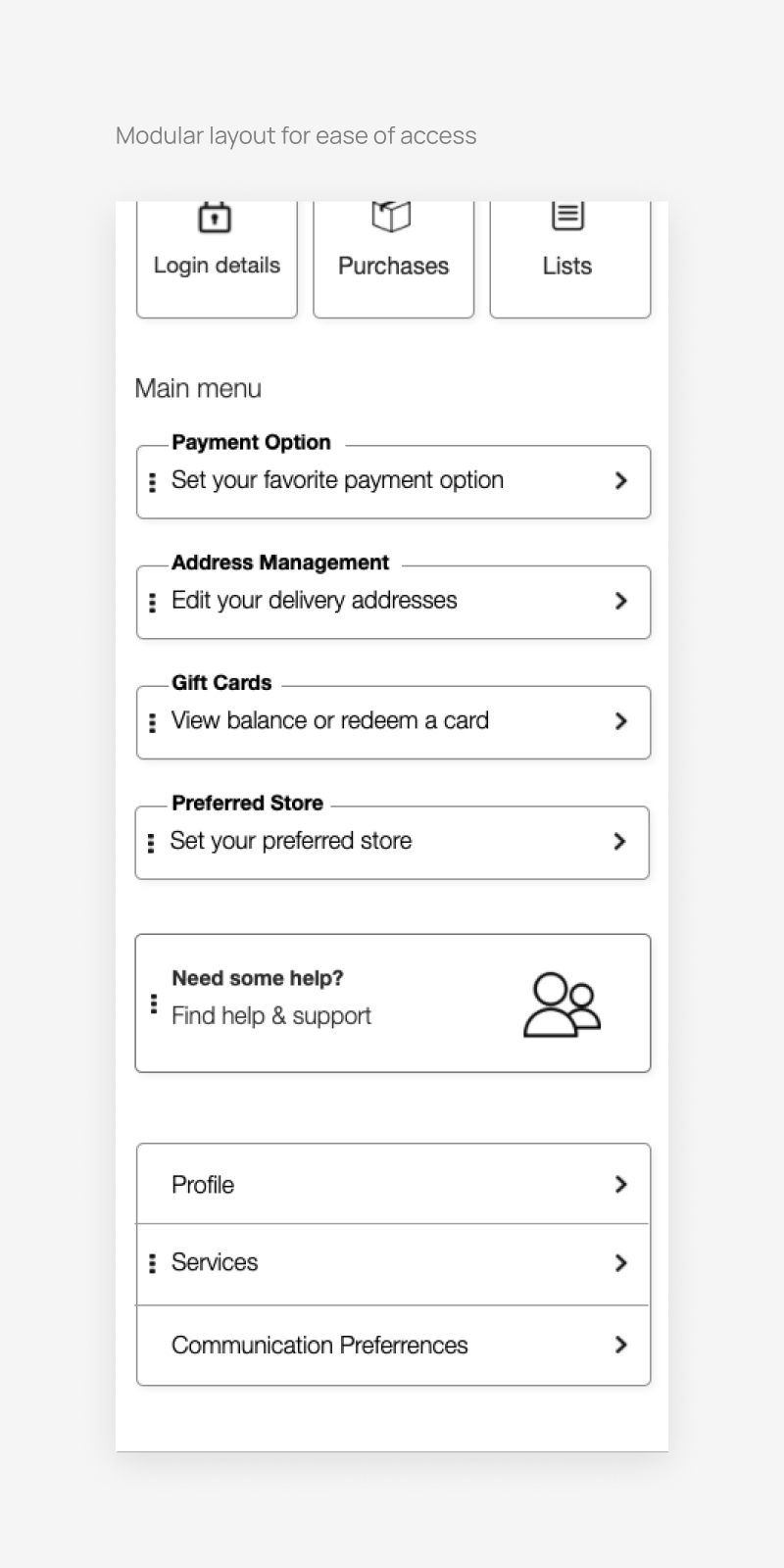
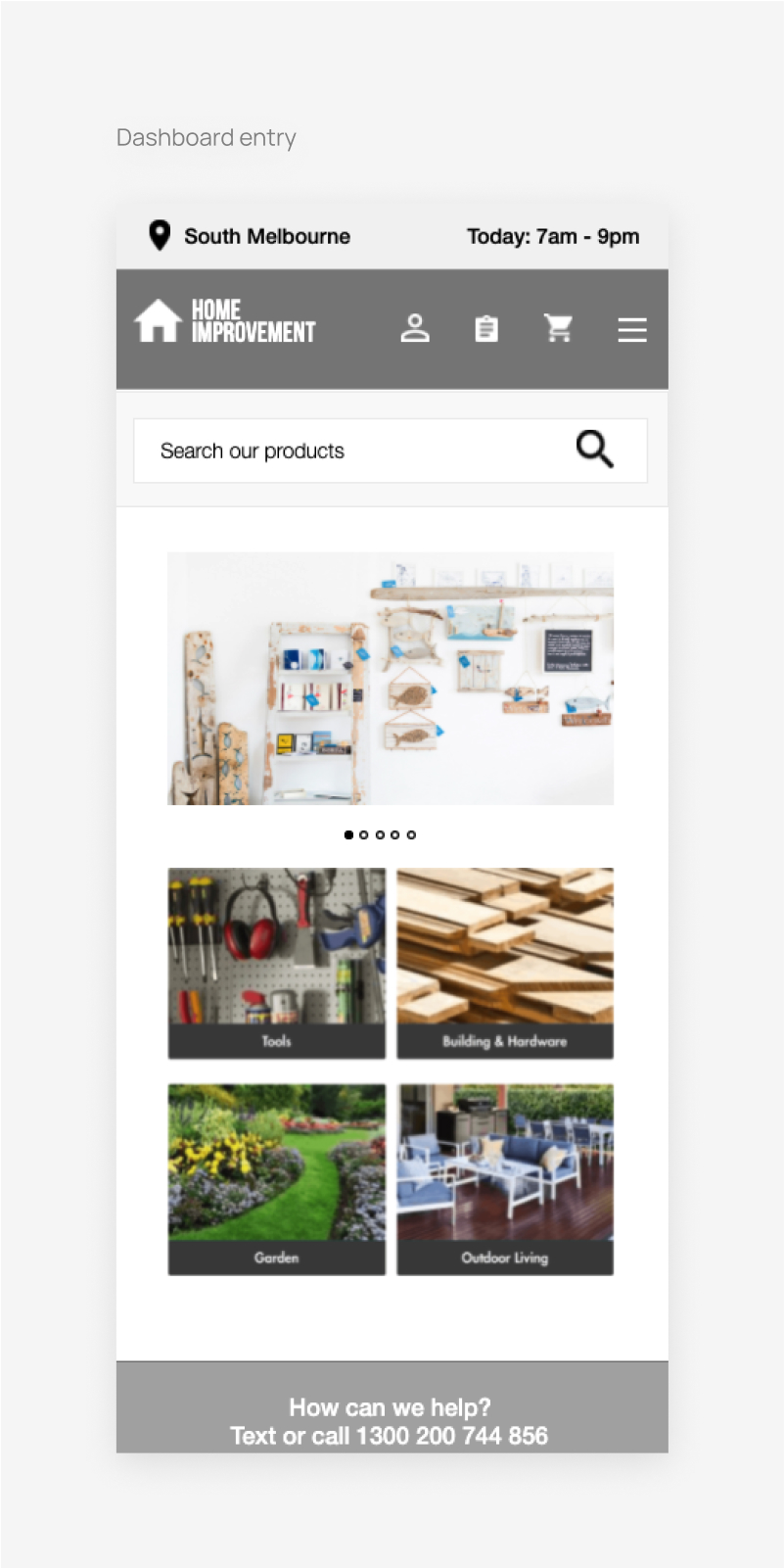
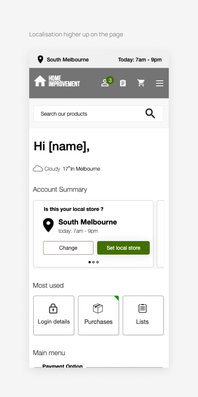
We refined the solutions through in-person user testing sessions with 10 Bunnings customers. The testing revealed a demand for increased personalisation in the dashboard, with a particular emphasis on increasing the hierarchy of preferred stores. This adjustment was important, as stock availability depended on the selected store for each account.
Bringing it all together
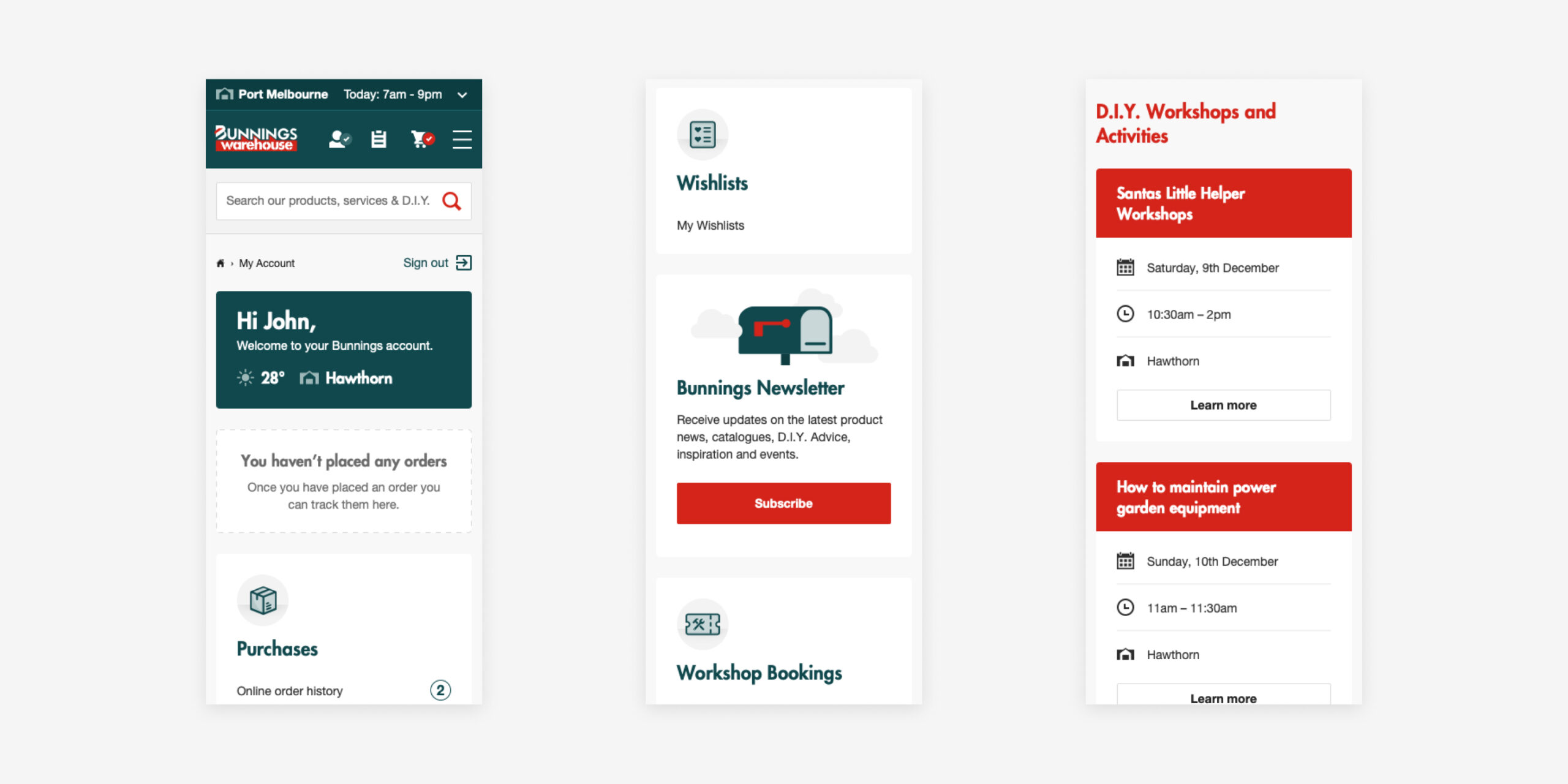
The new solution established a strong, mobile-optimised foundation for the growth of Customer Accounts. This proved essential for Bunnings as they expanded nationally.
During the visual design process, our focus extended beyond enhancing usability and accessibility. We also started to shape a fresh visual direction for Bunnings' iconography. Additionally, we introduced purposeful motion elements into the experience, injecting the brand's helpfulness pillar into the digital realm.


Outcome
5%
User feedback surveys showed a decrease to 5% reporting difficulty.
90%
Implemented changes led to a WCAG compliance score of 90% compared to the previous score of 54%
Wishlist and project lists
Wishlist interactions increased to an average of 300 clicks per week.
68%
After the redesign, mobile usage increased to 68% of total access from 30%
Some things I learnt
Collaboration with stakeholders, including Bunnings' internal digital team, was crucial in achieving positive outcomes. Collaborating across disciplines ensured that diverse perspectives contributed to a well-rounded solution.
Involving stakeholders in user testing sessions fostered a shared understanding of user needs and project goals. This collaborative approach ensured alignment between design solutions and business objectives.
Striking a balance between improving usability and injecting a new visual direction can be challenging but never impossible.
Learning to integrate accessibility testing as a standard part of quality assurance ensured a more accessible product.
Discovering that stock availability depended on the chosen store underscored the importance of understanding operational limitations in the business model, a crucial aspect that played a big role in finding the right solution.
Explore more projects
Explore more projects
© 2024
© 2024
