Redesigning the online experience for Australia's biggest superannuation fund.
Client
AustralianSuper
2019
Brief
Given AustralianSuper's outdated and visually cluttered website, lacking alignment with the brand's purpose and structure, our objective was to develop a new, accessible website while considering these shortcomings and their overarching objectives.
Contribution
User Experience – User Interface
User Research – Documentation
Accessibility – Project Management
Site
AustralianSuper

Background
The project aimed to thoroughly redesign AustralianSuper's online experience, to modernize the current digital infrastructure. This redesign ensures that the online platform aligns with the fund's objective of delivering exceptional value and user-centric services to its members.
Testing & research
We assessed our priorities for the new website and organized in-person user testing sessions with AustralianSuper customers representing various demographics. Participants were tasked with completing specific activities while a facilitator was present to guide the process.
Building for tomorrow
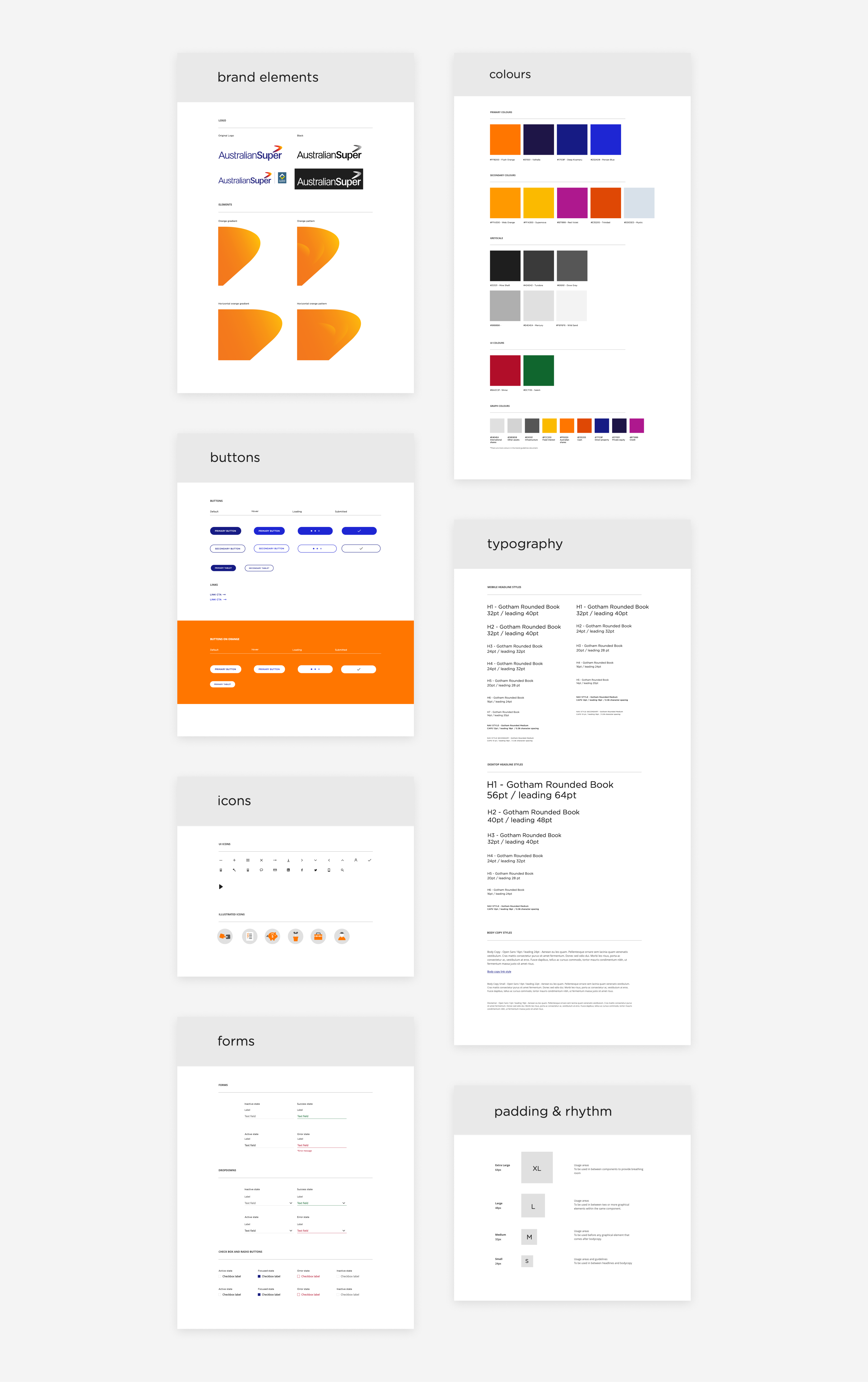
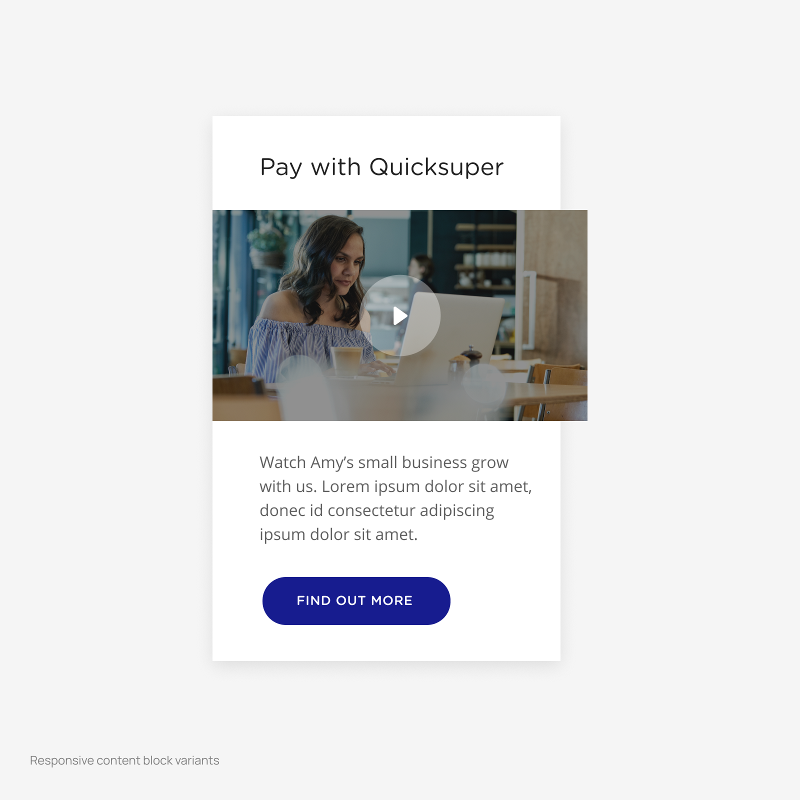
AustralianSuper lacked established component libraries. To develop a scalable design system, we consolidated all elements into a single source of truth. When initiating the website redesign, we began with the foundation and gradually incorporated newly designed components into the system.
Flexible layout systems
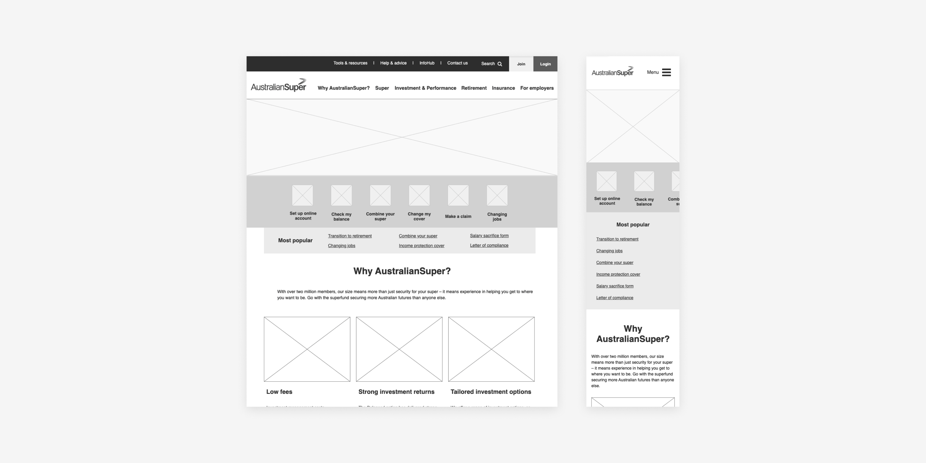
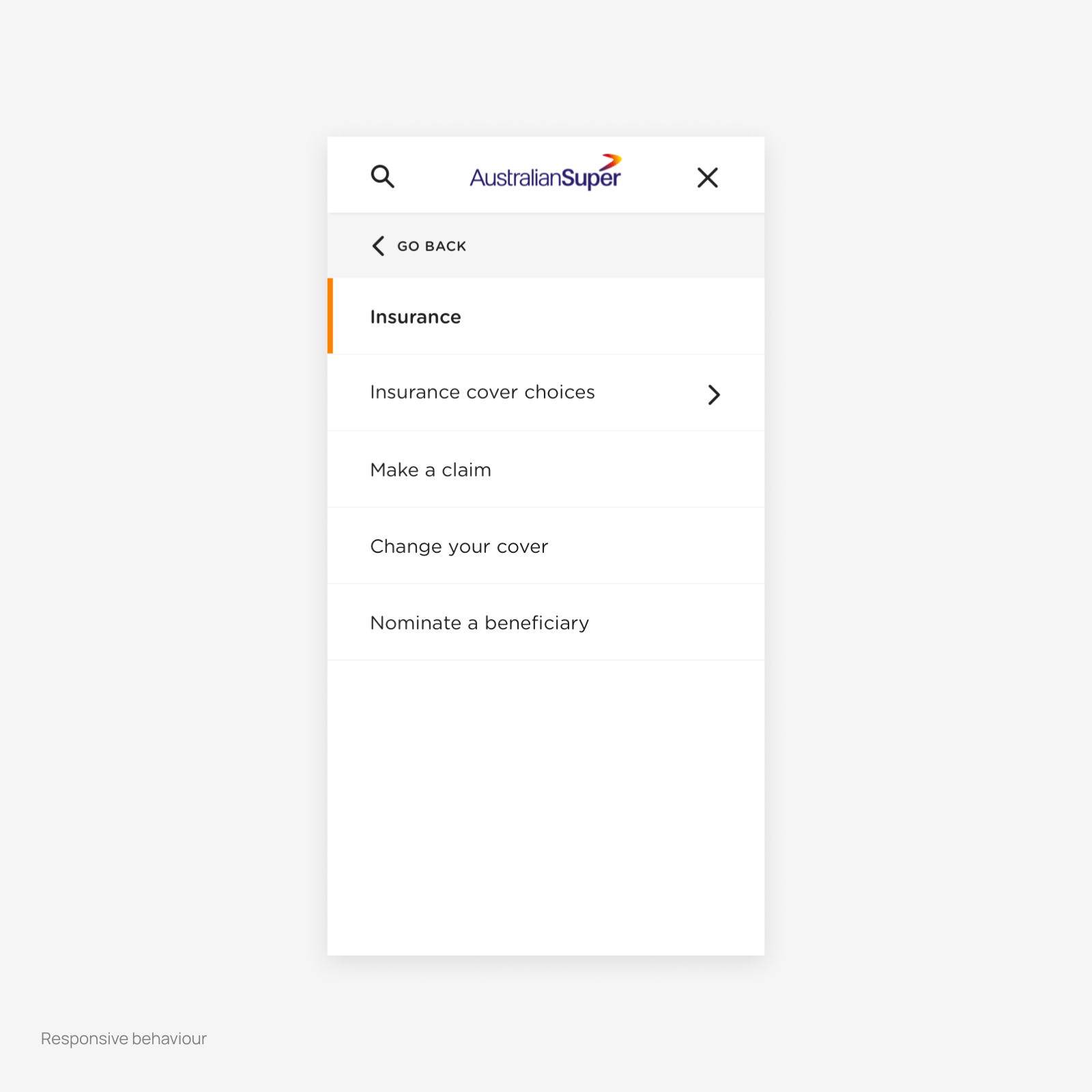
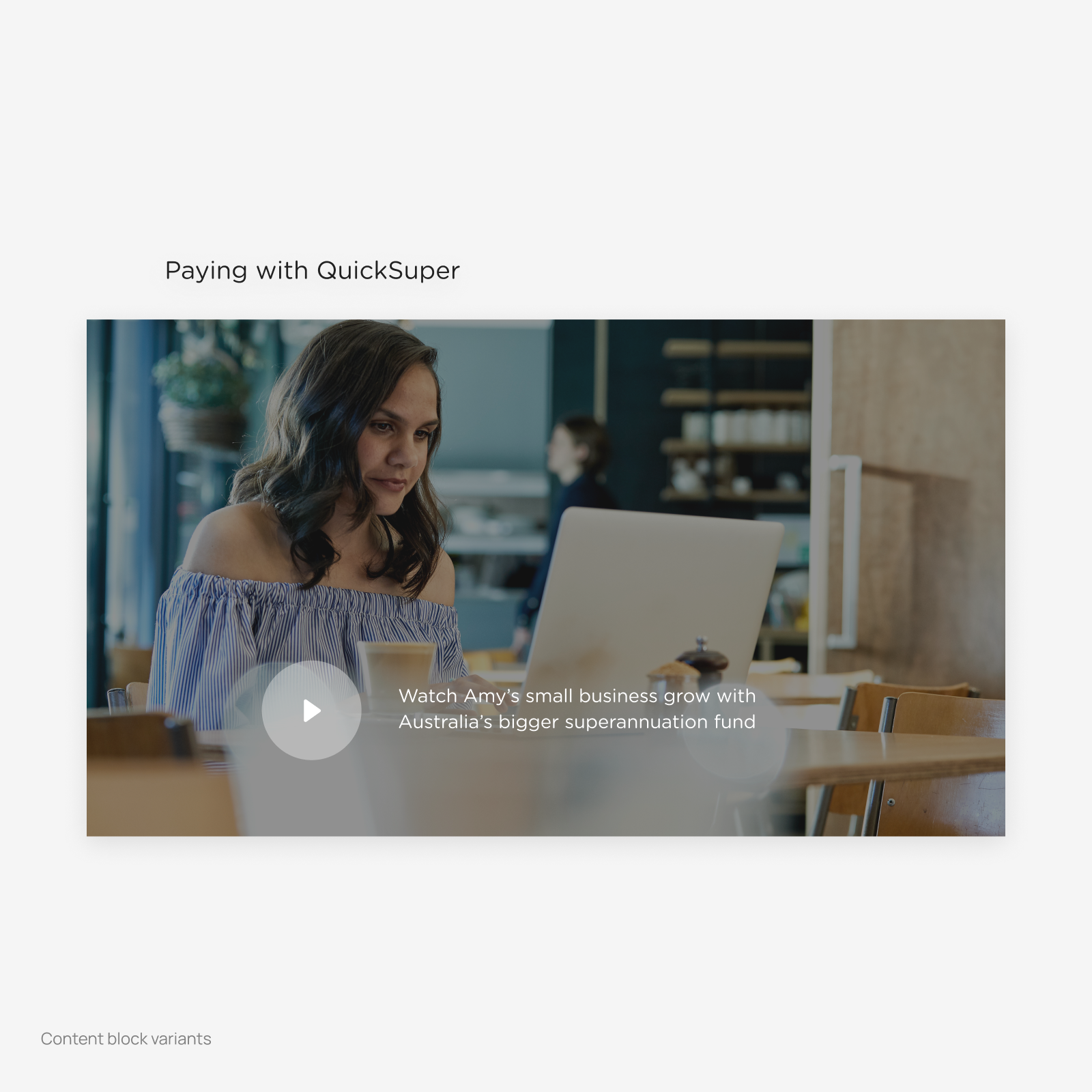
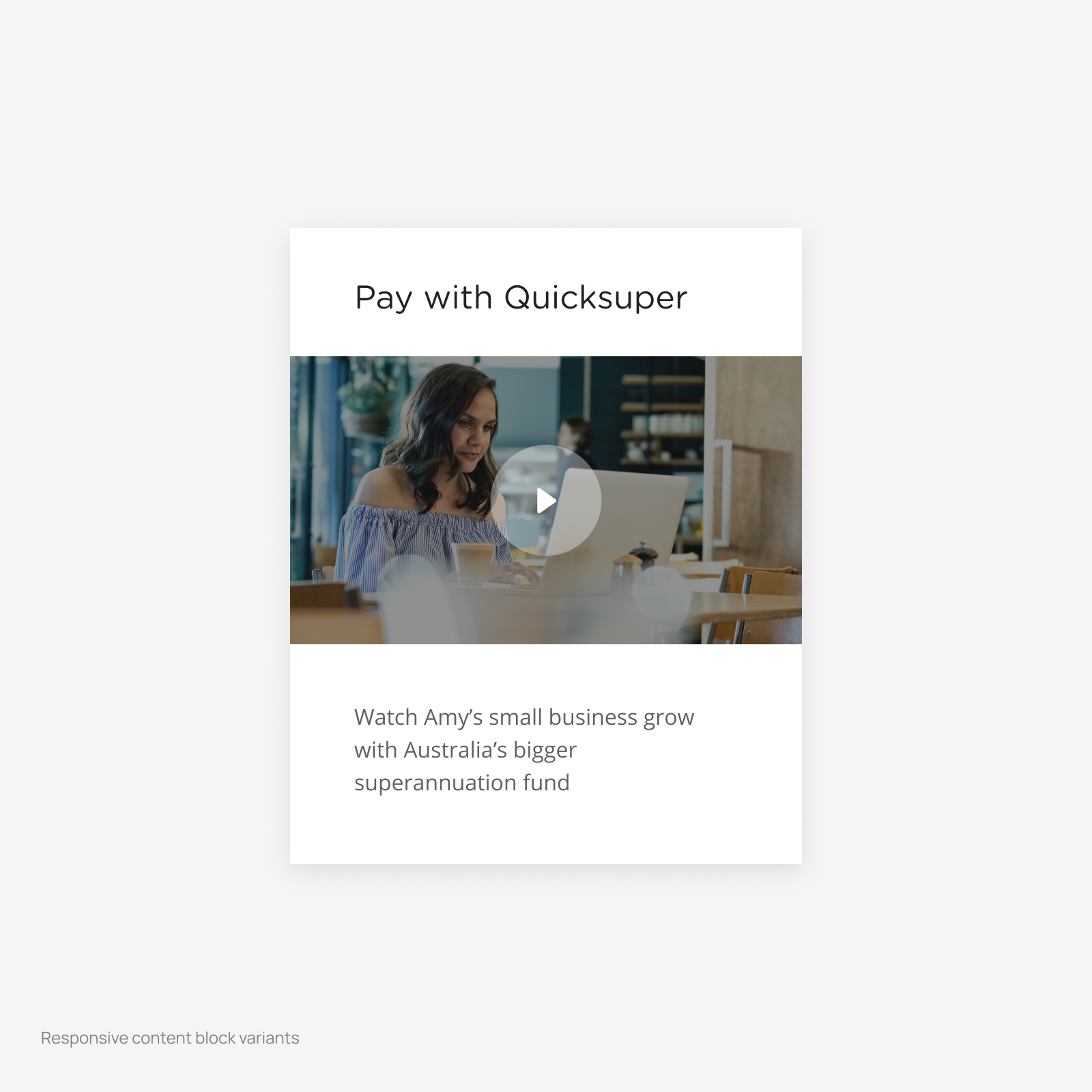
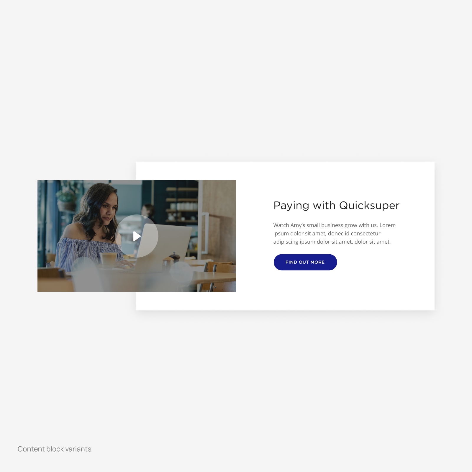
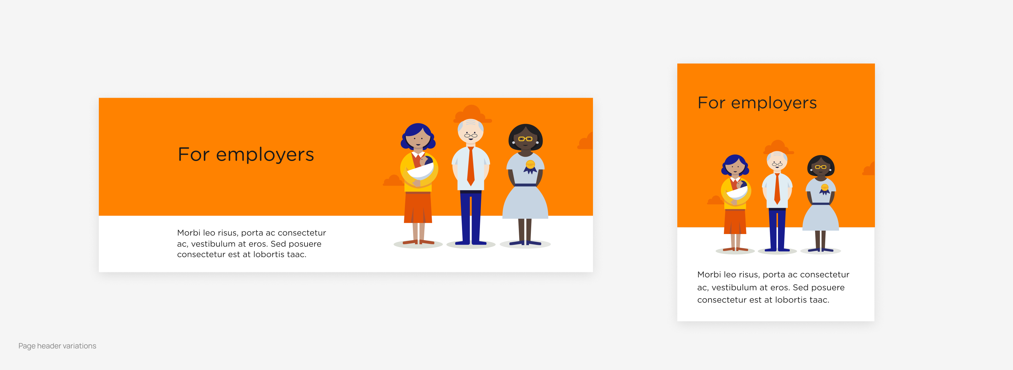
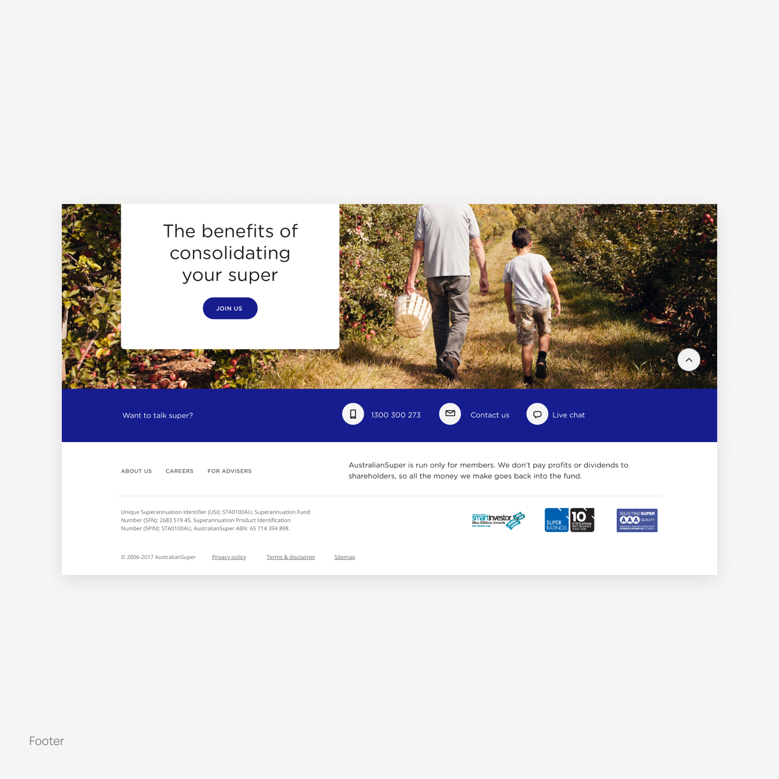
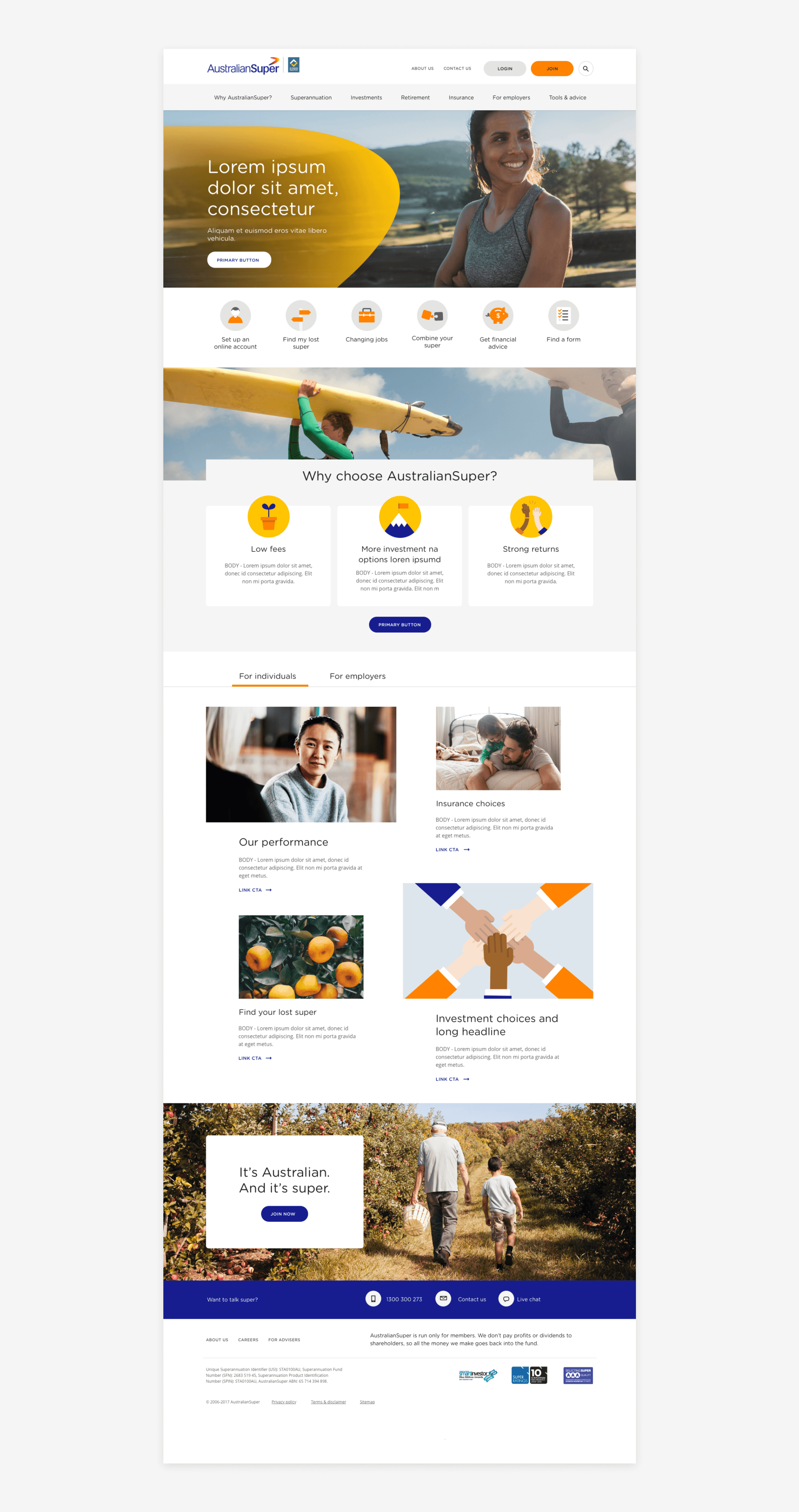
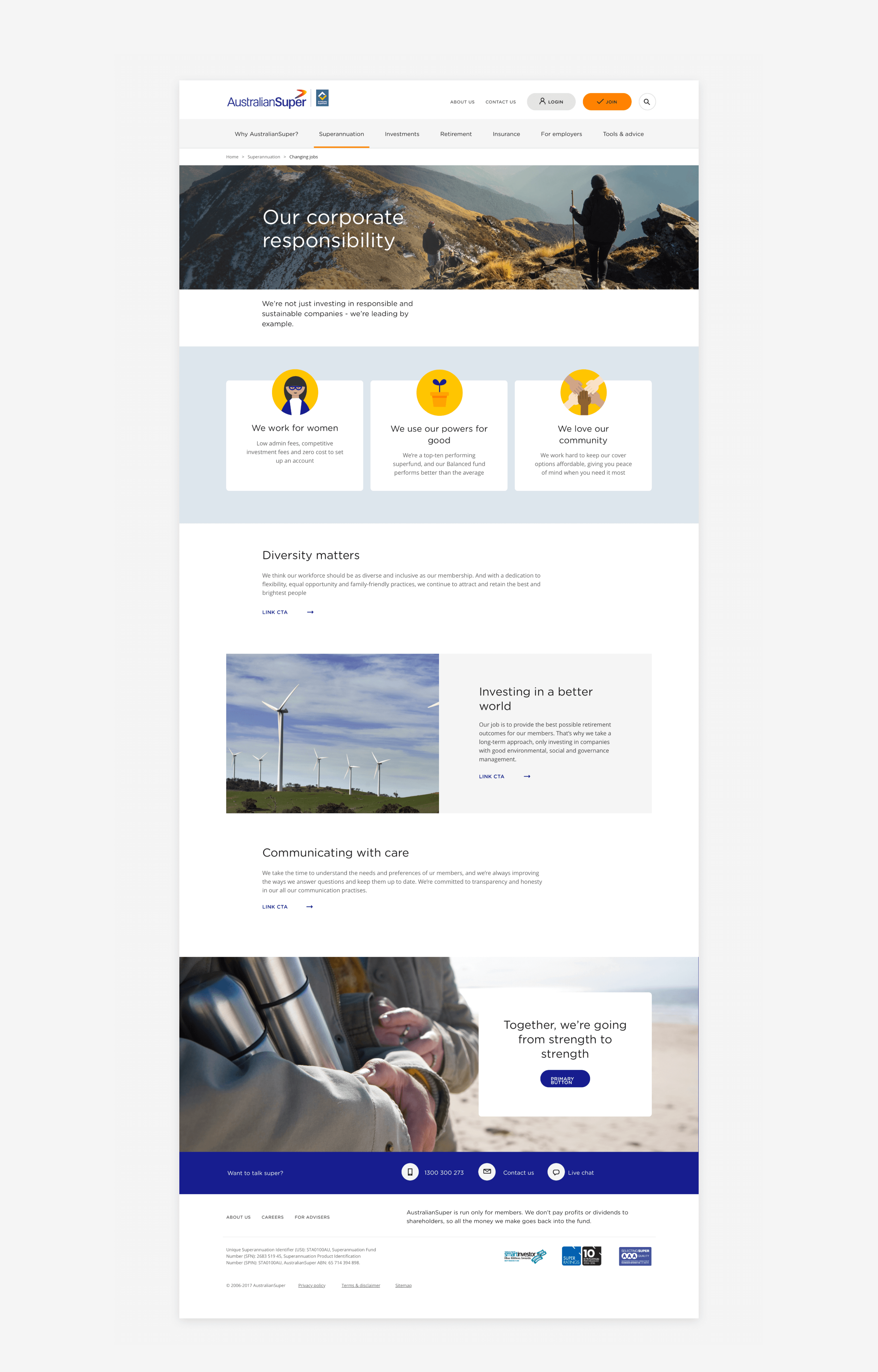
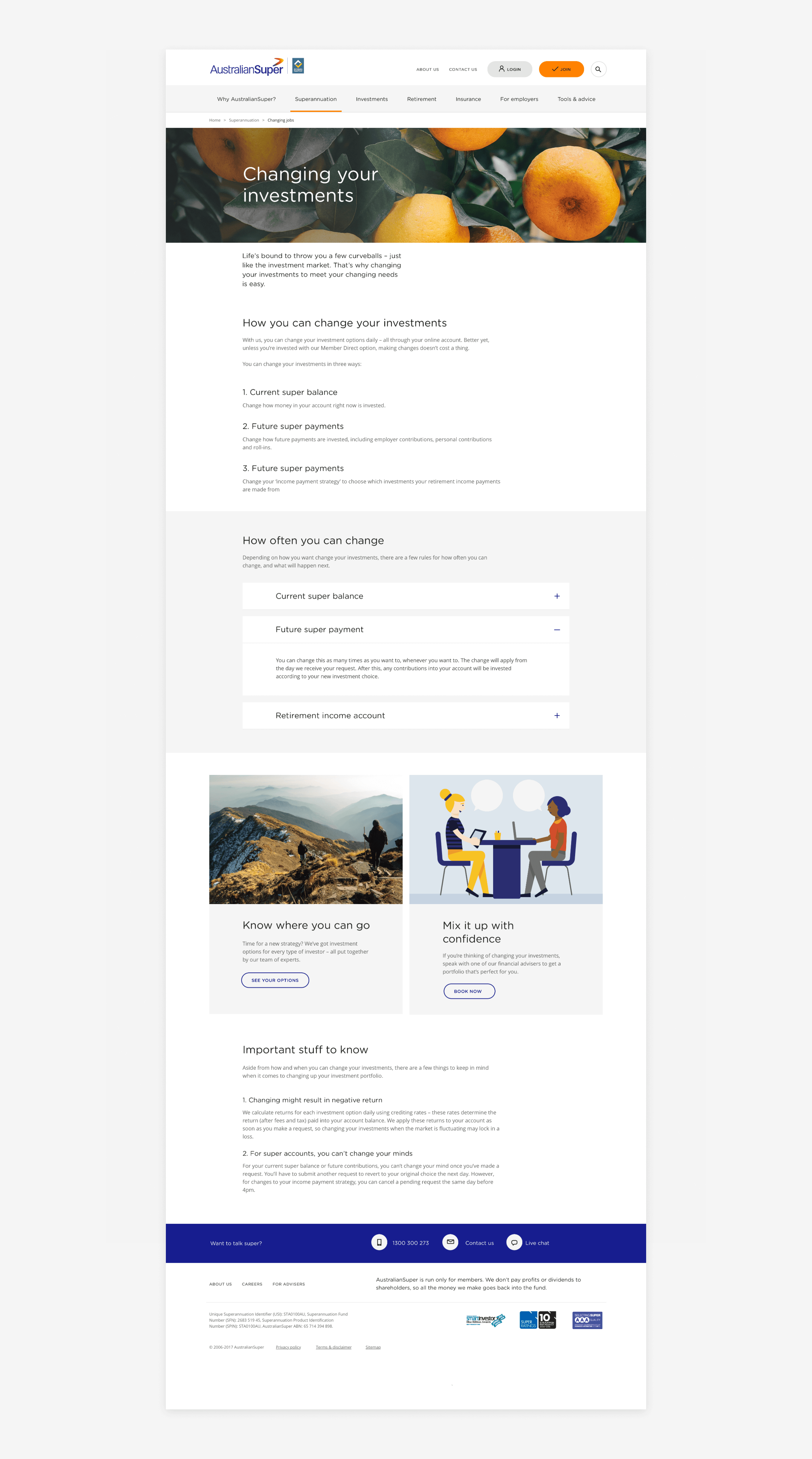
Utilising the components in our new design system, we've adopted a modular layout approach to design our page layouts. This approach provided us with flexibility as we assembled the pages, ensuring smooth integration of elements. Additionally, it promoted consistent use and improvement of existing components throughout the design process.

Bringing it all together
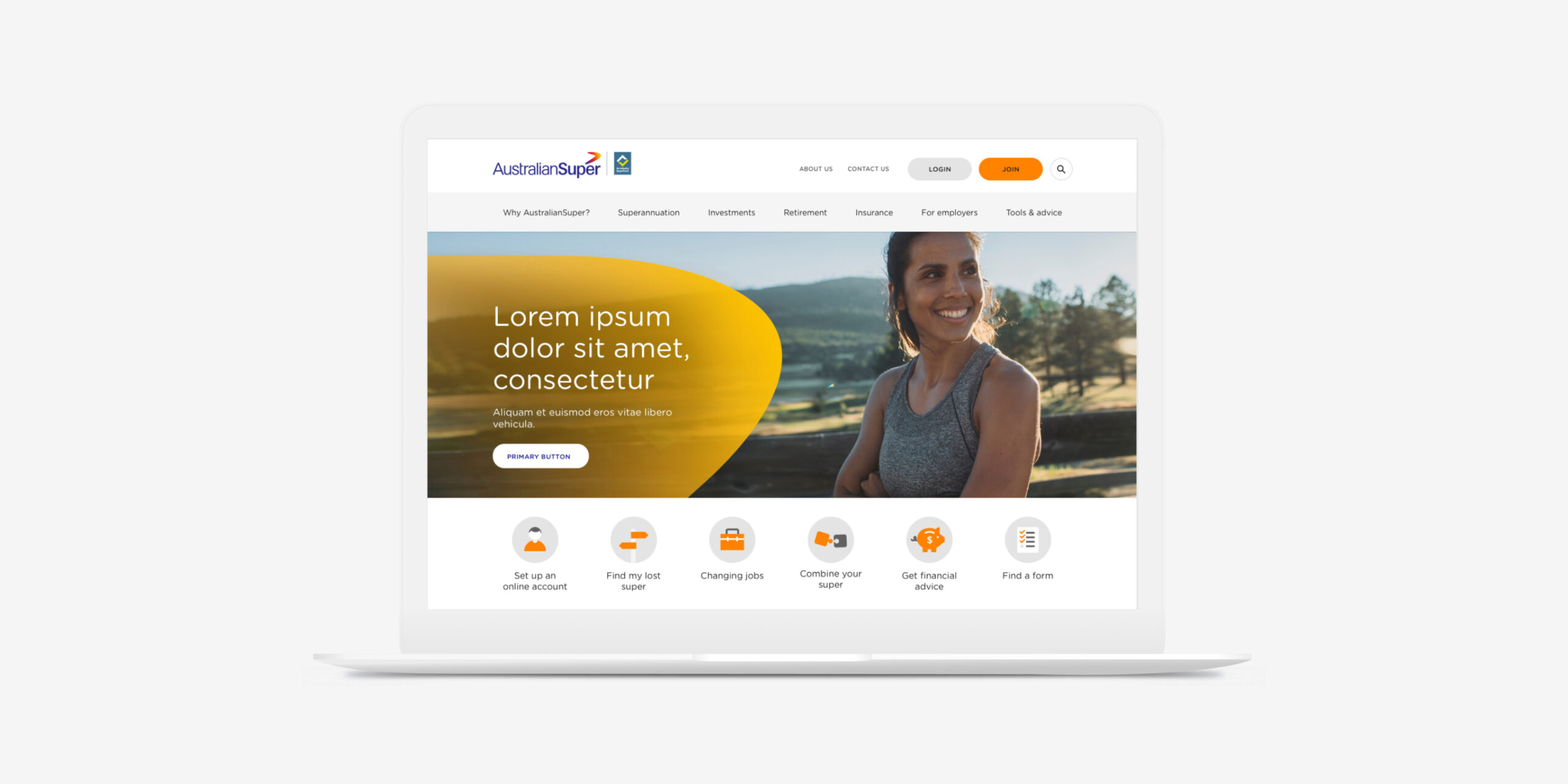
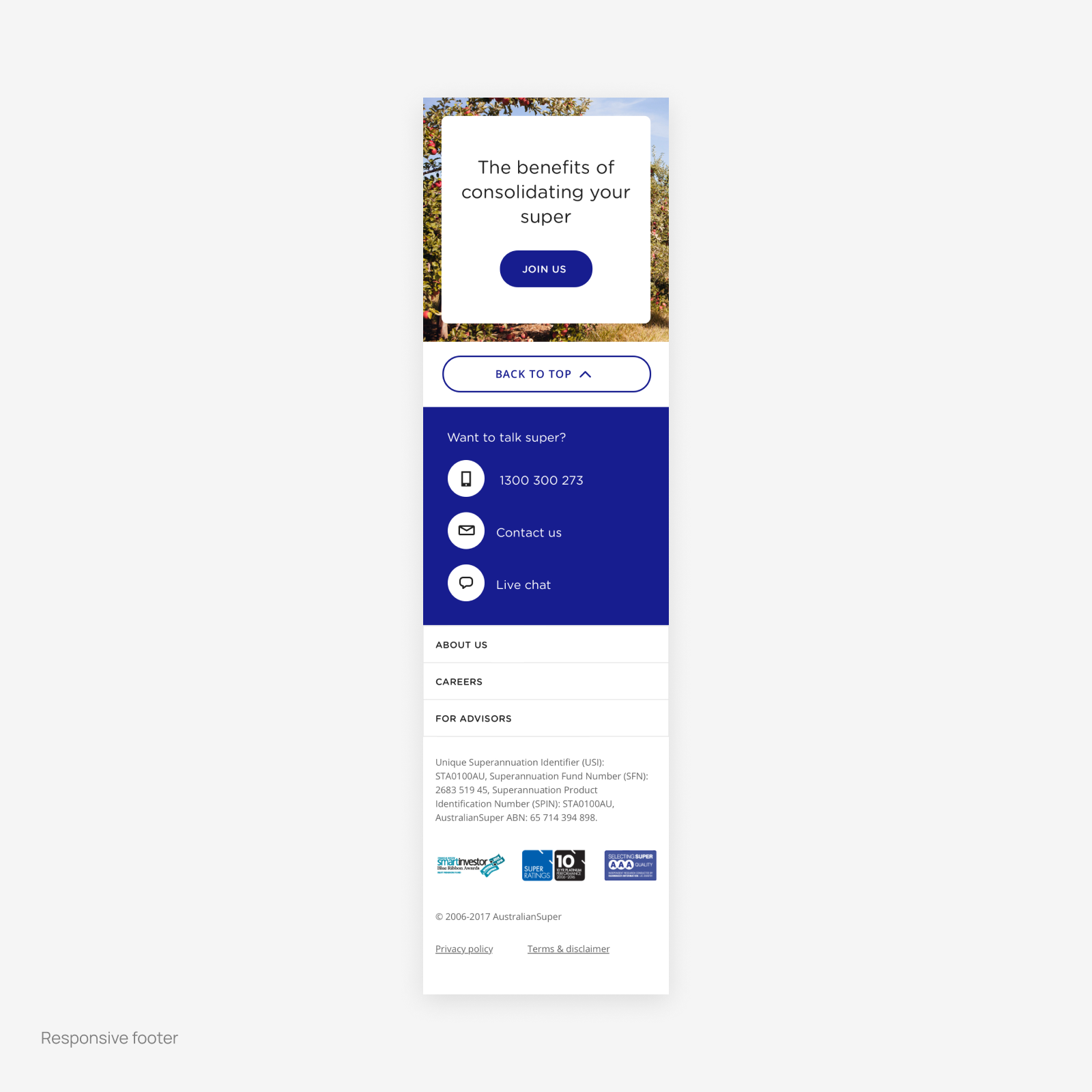
We then utilised these components to construct our page layouts, ensuring a cohesive and harmonious design throughout the website.
Some things I learnt
Conducting thorough accessibility audits and adhering to WCAG guidelines from the outset of the redesign process significantly elevated our accessibility compliance ratings, ensuring inclusivity for all users.
The audience you’re designing for is everything. By prioritising accessibility features such as larger font sizes, streamlined navigation, and prominent call-to-action buttons, we empowered retirees with age-related visual impairments to navigate the website easily and confidently.
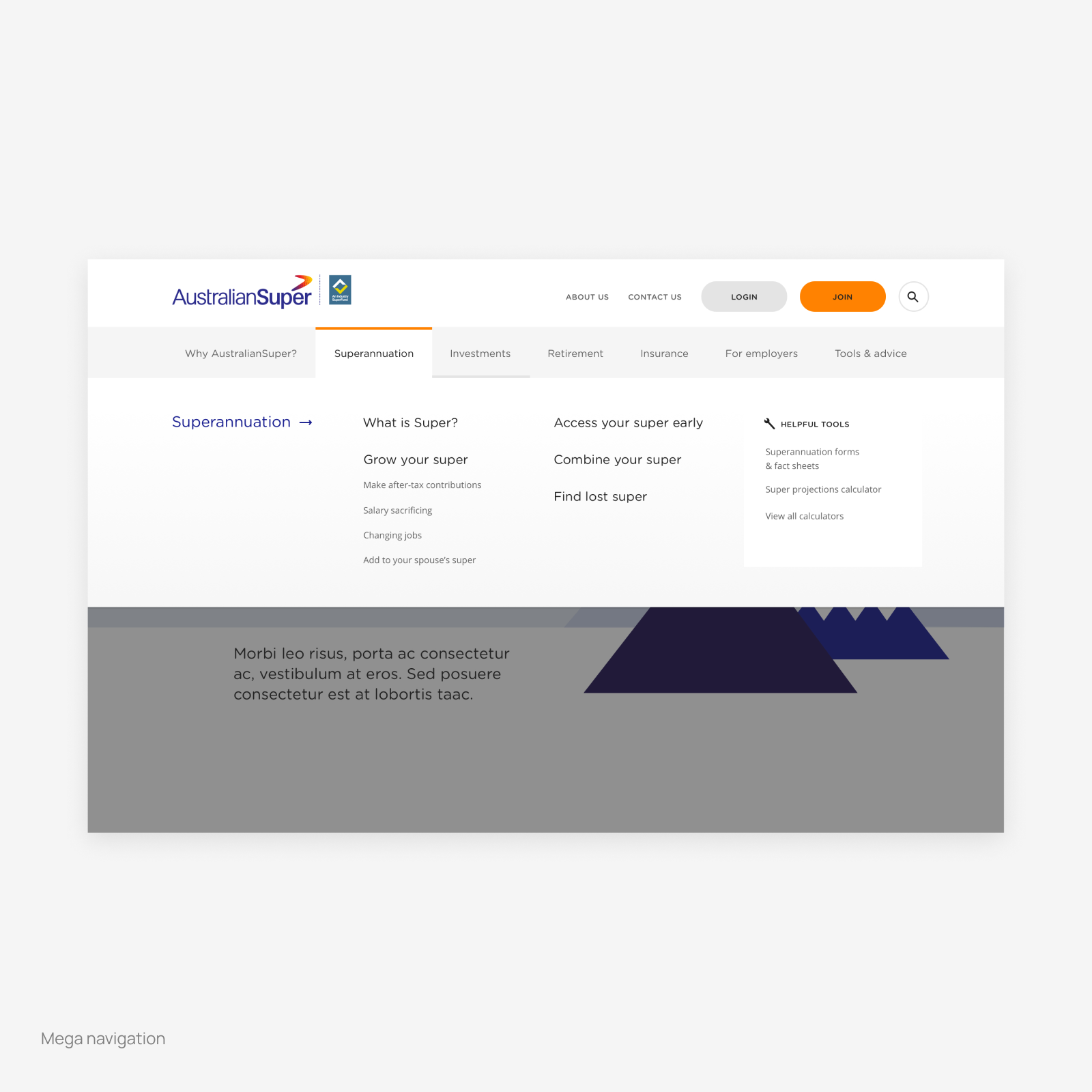
Navigational clarity was crucial for AustralianSuper’s customer base. Research showed the need for further simplified navigation structure and intuitive labelling. Doing these and providing contextual guidance in the right moments helped retirees confidently navigate the website without feeling overwhelmed.
Creating reusable components for page and content population proved crucial during the redesign. We built a library of modular elements such as card layouts, form fields, and content containers, which streamlined development and maintained consistency. This method sped up the design and implementation of new pages while simplifying content updates and maintenance. It also enhanced flexibility and scalability in managing the website's content ecosystem.
Explore more projects
Explore more projects
© 2024
© 2024